Color is not just a tool but a powerful language that can express emotion and deliver a powerful message to the viewer or audience. The color has the power to define the mood, semantics, message, and feelings of the project. The graphics designer can only drive the audience’s attention to visuals such as infographics, charts, graphs, animated GIFs, and other graphics by using eye-catching colors.
You should know the basic design principles and color tips to enhance your graphics and visuals. A design can be effective by using a balanced color palette.
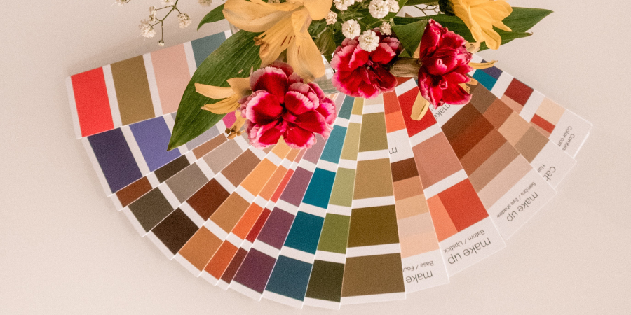
Below are the tips on How to Use Colors in UI Design from graphics designers:
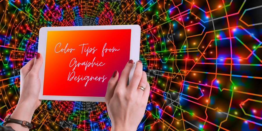
Color Tips from Graphic Designers
1. Follow the Color Theory 101:
We all study the basics of color in high school. The basic color theory is an important part of graphic design or UI design.
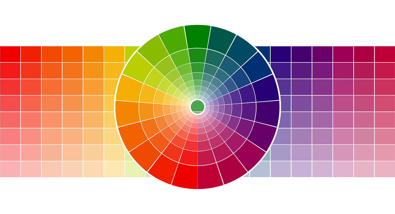
There are three types of color; primary, secondary, and tertiary. The colors which can’t be created by combining two or more colors are known as Primary colors. There are three primary colors; red, yellow, and blue. Secondary colors are those colors that are created by combining the primary colors. Orange, Green, and Purple are the secondary colors. For example, orange is created by combining red and yellow. Tertiary colors are made by the combination of a primary color and a secondary color.
The computer gives you more color options than 12 basic colors. You can create brighter, lighter, softer, and darker color options by combining white, black, and gray with the basic colors. You can also change hues, tints, tones, and shades of these 12 basics color to get more colors.
You can also follow the subtractive color model (CMYK) and additive color model (RGB) of light waves to create any color you want and choose the right color for your project.
2. Color psychology

Color is a powerful communication tool that can influence the mood and actions of the users. It can even affect physiological reactions by increasing blood pressure and metabolism, slowing heartbeat and expiratory flow rates; and affecting eyestrain. Therefore, choose a color in your project that affect customer psychology and influence them.
- Red:
- Power and Energy
- Passion and love
- Danger
- Can help in taking action on the website
- This color also increases hunger. So, perfect for food-related projects
- Orange:
- joy and enthusiasm
- Positive messaging
- Associated with food
- Yellow:
- Happiness and intellect
- Optimism and positivity
- Associated with food
- Summer
- Green:
- Growth or ambition
- Nature
- Money
- fertility and health
- Safety and medical related
- Blue:
- Tranquility and confidence
- Strength and stability
- Calmness and relaxation
- Lighter shades of blue provide a sense of peace
- Tech Industry
- Purple:
- Luxury or creativity
- Wisdom and spirituality
- But using too much purple can cause feelings of frustration
- Black:
- Power and mystery
- Elegance and sophistication
- It can also stimulate emotions such as sadness and anger
- White:
- Safety and innocence
- Cleanliness and purity
- Represents neutrality or space
3. Well-balanced color scheme:
Using too many colors in our project can confuse the users. Therefore, selecting the right color combination and balancing them for perfect visual experience is necessary. There are a few simple and very effective rules which can help in color balancing.
60-30-10 Rule:
The 60-30-10 rule is a simple rule to choose a color palette for your project where the 60% of the palette should be dedicated to neutral color (any 1 color), 30% should be another complimentary color, and thrid color should be for remaining design.
Rule of Maximum 3 color:
If you are not an expert in combining multiple colors that try to use maximum three colors in your design. The design will look like a clown if you failed to make perfect color combination.
The best example of three color rule is facebook. They use lighter and darker version of blue colors in their apps, website and logo.
4. Personal Preferences of Client:

If you are designing a graphic for your client then you should know about the personal preferences of a client. Find out what color your client wants in a design, and what is the motto behind the design.
For example, there are a few people who hate blue. So, even if it is the right color for the design you can’t use it.
5. Pick a color Related to the Industry
This is a very important point in picking the color for your project based on their industry. For example, Green color relates to medicine, warm colors like orange and maroon belong to food, and Blue color belongs to service.
There are no hard-and-fast rules exist about the industry and related colors. But certain color do team up with certain industries. If we take the example of Hight tech company like TATA, their logo color is blue. The blue color shows strength and stability. Red and yellow colors increase hunger. That’s why McDonald’s uses those colors in their logo.
6. Design in grayscale first:

Always try to make a grayscale before design. This will help designers in focusing more on creating beautiful visuals with powerful colors. You can explore infinite number of color combinations in grayscale and finalize the best one.
7. Look to Trends
There is no specific hard and fast rule of using perfect color for your design. Many factors can affect the color choosing process and “latest trend” is one of them. The latest color trends always gets influenced by the popular event happening around us like sports, music, politics, technology, season, and more.
For example, in 2022 warm colors make their comeback and replaces the cooler colors. Earthy tones like beige and brown got popular in 2022. Colors like red, tangerine and orange are also trending this year
Read more, Best illustration Apps for Drawing and Painting
These are the popular tips on using color in your design. If you are new to designing then these tips can help you in selecting perfect colors for your project.