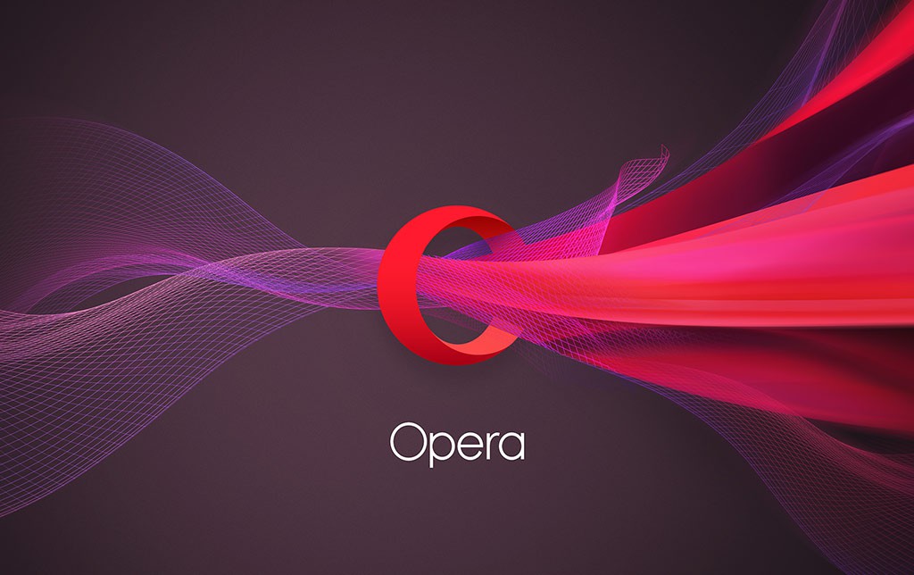
 ‘Opera Software’ is now just ‘Opera’. Company has refreshed its brand identity with new logo and refreshed look. Company claims that new logo is more than just the first character of company’s name.
“The 3-dimensional “O” symbolizes a gateway that leads you to more: more content, more discoveries, more answers, more communication, more fun, more data savings, more of life – whatever you seek online, Opera helps you do more!,” Opera noted in blog post.
Opera is now more than just a browser company with its various products. Still, core products are browsers for which world know it. Opera confirms that more than 350 million people use Opera apps across various platforms. It also confirmed that its ads platform ‘Opera Mediaworks’ serves ads to around 1.1 billion people monthly.
Opera Mini for iOS will be the first product to get this new logo. In coming months, we will see other Opera products to get this new logo.
What do you think about this new logo? Share your thoughts via comments.
SOURCE: Opera


