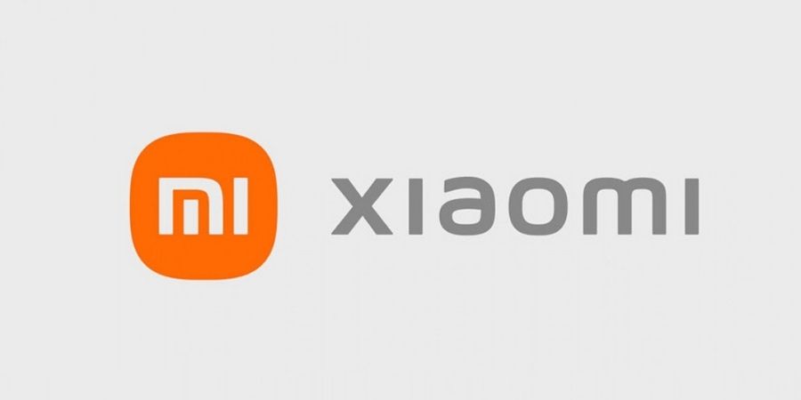
Today, Xiaomi announced a refreshed corporate visual identity with the design concept of “Alive”. Xiaomi’s new logo has been designed by a world-renowned designer Kenya HARA. The new logo adopts the rounded corner and includes redesigned “MI” typography. The color remains orange but Black and silver will also be used as supplemental colors.
Now if you compare the older and newer logo, you will find the only difference in the outer potation. Previously, it was a square with rounded corners while it is now squircle. Even if you can’t see much work here, Xiaomi says that the designer has used the “superellipse” mathematical formula for the design and adjusted the variables to get a visually optimal balance between a square and a circle.

Xiaomi’s CEO Lei Jun says that the new logo is part of a bigger overhaul of Xiaomi’s “brand identity.” It is embraces the philosophical thinking, making the logo truly come “Alive”.


