
Design always starts with clarity. Before colors, typography, or animations enter the picture, there has to be structure. I have been working on software and application projects for years under Techlomedia Internet. Over the years, while working on websites, content platforms, dashboards, and early-stage product ideas, I have learned that skipping structured wireframing almost always leads to confusion later. Many teams still jump straight into high-fidelity design. It feels productive in the beginning. But without a solid wireframe, feedback becomes subjective, revisions increase, and development timelines stretch unnecessarily.
This guide is based on hands on testing of leading wireframe tools across real workflows. The goal is simple. Help you choose a tool that fits your process, team size, and product goals, not just what is trending.
Before we compare tools, it is important to understand what a wireframe really is and why it continues to play such a critical role in digital product development.
What Is a Wireframe and Why It Matters
A wireframe is a low-fidelity visual representation of a digital product. It outlines layout, content structure, navigation flow, and key functional elements without focusing on final design details like color schemes, fonts, or images.
You can think of it as the blueprint of a website or application.
In a wireframe, images are often represented by grey boxes. Text is shown as simple lines. Buttons, menus, and forms are placed in approximate positions to define structure rather than aesthetics.
Why Wireframing Is Important
1. It Separates Structure from Visual Design
When teams review polished designs too early, conversations often shift toward colors, branding, and personal preferences. Wireframes remove that distraction. They keep the discussion focused on layout logic, user journey, and functionality.
2. It Reduces Costly Rework
Changing the layout structure during development is expensive. Identifying usability gaps at the wireframe stage is far more efficient. A simple structural adjustment early can prevent major redesign later.
3. It Improves Stakeholder Alignment
Product managers, developers, marketers, and designers often look at problems from different angles. A wireframe provides a shared visual reference. It makes abstract ideas tangible and easier to evaluate objectively.
4. It Supports Better UX Decisions
User experience is not about decoration. It is about clarity and flow. Wireframing forces teams to answer critical questions:
- Where does the user land first
- What action should they take next
- How many steps are required to complete a task
- Is the navigation intuitive
Answering these questions at a structural level leads to stronger products.
5. It Speeds Up Iteration
Wireframes are intentionally simple. That simplicity makes them fast to create and easy to modify. Teams can test multiple layout approaches quickly before investing time in detailed design systems.
Now that you understand wireframing, let us go tool by tool.
Best Wireframe Tools
1. Figma
Best for Team Collaboration and Scalable Design
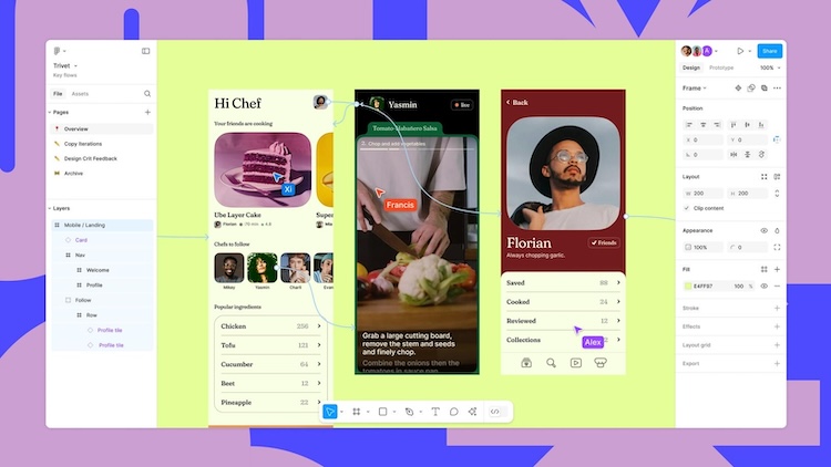
When you think about modern product design workflows, Figma often comes to mind first. Over the years, it has evolved from a basic wireframing tool into a full design platform used by startups, large enterprise teams, and independent designers alike.
I have personally used it on projects ranging from simple landing pages to complex multi-screen web and mobile apps. What sets it apart is how naturally it supports collaborative thinking and iterative design.
What Figma Is Good At
Real-Time Collaboration: Figma’s strongest advantage is its live collaboration. Multiple people can open the same file at the same time. Designers, developers, product managers, and stakeholders can view and comment in real time without needing separate plugins or exports.
This works much like Google Docs: everyone sees updates instantly, which reduces feedback loops and streamlines decision-making.
Flexible Wireframing to High-Fidelity Workflow: You can start with very basic wireframes using simple shapes and placeholder text. Then, as the design evolves, you can refine it into a high-fidelity UI all in the same file. That means you do not have to export and switch tools when your project grows.
It also has pre-sized frames for common device types, so you do not waste time looking up screen dimensions.
Design Systems and Shared Libraries: Figma allows you to create shared component libraries for colors, buttons, forms, icons, and more. For teams working on large products or multiple projects, this keeps everything consistent without repeating work. Updating a component in the library automatically updates it across all design files that reference it.
Plugins and Ecosystem: There are hundreds of plugins available, including icon sets, UI kits, accessibility checkers, and automation tools. These can make routine tasks faster and help keep your files organized.
Where Figma Can Feel Challenging
For total beginners, Figma’s interface and advanced features can feel overwhelming at first. Things like auto layout, constraints, and responsive design tools take some time to learn. However, once you are comfortable with the basics, these features save a lot of manual work later.
Device Support and Access
Figma runs in the browser and also has desktop apps for both Mac and Windows. There are also companion apps for iOS and Android that let reviewers view designs on real devices.
Pricing Snapshot
- Free plan: Good for individuals and small side projects
- Professional plan: Around $16 per user per month with unlimited projects, version history, and team libraries
The key difference between free and paid plans is collaboration scale and access to team libraries. For solo designers or testers, the free tier is enough to start.
Figma is best for for teams working together on web and mobile products. It is ideal for projects that require both wireframe and detailed UI design in one place. If your goal is to have one tool that grows with your project from concept sketches to final design handoff, Figma delivers that experience more cohesively than most alternatives.
2. Moqups
Best for Beginners and Simple Layouts
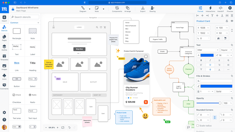
If you are new to digital design tools, Moqups can be a comfortable first step into structured wireframing. It is straightforward, browser-based, and does not overwhelm you with too many advanced features at the start.
I have used Moqups many times when I needed to sketch basic flows quickly, share them with a team, and iterate without heavy setup. It is especially useful for founders, product managers, or marketing teams who want clarity without a steep learning curve.
What Moqups Does Well
Easy to Get Started: Moqups opens up with templates that help you begin designing immediately. Whether it is a mobile login screen, dashboard layout, or simple web homepage, you do not have to start from a blank canvas unless you want to. That makes the initial hurdle much lower for first-time users.
Stencil Libraries for Rapid Layouts: The left panel includes a library of UI elements called stencils. These are pre-designed shapes for buttons, forms, navigation bars, icons, and more. You can drag them onto the canvas and arrange them quickly, which speeds up early-stage wireframing.
Basic Collaboration and Sharing: Moqups supports real-time commenting and shape annotations. Teammates can view your work and leave feedback directly in the project. This basic collaboration is helpful when you want quick alignment without setting up complex workflows.
Limitations You Should Know
Limited Advanced Features: Moqups does not offer many tools for creating high-fidelity UI or detailed prototypes. There is no advanced interaction logic, animation support, or deep customization. If your project moves beyond the wireframe level, you will likely want to export and switch to a more powerful app for refinement.
Export Options Are Basic: You can export your wireframes as PNG, PDF, or HTML. However, formats like SVG or detailed design specs for developers are not available. This is fine for early-stage sharing, but not ideal for handoff to engineers.
Interface Can Feel Cluttered: While the tool is simple in intent, the workspace can feel visually dense at times because all tools and stencils are visible by default. It takes a little adjustment to build efficient habits in arranging and organizing layers.
Pricing Snapshot
- Free plan: Limited to a small number of objects but enough for learning and simple prototypes
- Paid plans: Around $9 per month for an individual with unlimited objects, or about $15 per month for teams with real-time collaboration
The free tier is generous enough for experimentation, but if you want to collaborate regularly with others, a paid plan becomes more useful.
Moqups is well-suited for startup founders sketching early ideas, teams that need simple wireframes and flowcharts, or Workshops where non-designers need to participate actively. It is also good for projects that do not require advanced prototype interactions
Moqups is not a replacement for tools like Figma or UXPin when it comes to detailed UI design or design systems. Instead, it can be a starter tool for exploring layout options before committing to a full design or
running internal reviews on basic structure. It helps you move quickly from a blank idea to a shareable visual concept, without the friction that comes with learning more complex tools.
3. Balsamiq
Best for Non-Designers and Clear Early Concepting
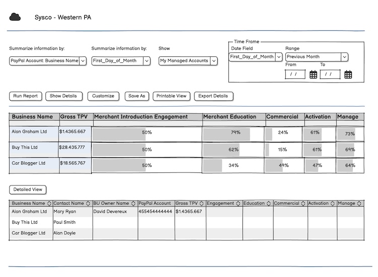
If your goal is to communicate structure and ideas without getting bogged down in visual details, Balsamiq has a very specific strength. It strips design down to its essentials so your audience focuses on how a screen works rather than how it looks.
I have used Balsamiq in workshops, early feedback sessions, and internal planning meetings where stakeholders are more interested in what happens on a page than how it looks. That focus makes it a strong choice for non-designers and teams that want quick alignment.
What Balsamiq Does Well
Simple, Sketch-Like Interface: Balsamiq has intentionally minimal visual styling. Elements appear rough and hand-drawn on the canvas, which signals to everyone that this is a structural draft. When people see a Balsamiq wireframe, discussions naturally avoid color, typography, and polish.
This simplicity also makes the tool very easy to use. You do not need prior design experience to place buttons, forms, menus, and other interface components.
Pre-Built UI Elements: The library includes common interface items mapped to real user patterns, such as navigation bars, forms, lists, and icons. Dragging and dropping elements onto the canvas is quick, and the design remains readable even if you are not a trained designer.
Presentation and Sharing: When you need to show concepts during a meeting or review session, Balsamiq offers a simple presentation mode. You can walk through screens in sequence, explain user flow, and gather feedback without exporting assets or switching tools.
Where Balsamiq Is Limited
Low Fidelity Only: Balsamiq does not support advanced interactions, responsive design frames, or detailed prototyping. Each screen is static, and linking between screens is basic. This makes it great for structure exploration, but not suited for testing interaction logic or transitions.
Not Made for Final UI or Developer Handoff: If your project requires polished UI mockups or detailed specifications for development, you will need to move to another tool after your initial Balsamiq sketches. It does not produce code or detailed style sheets.
Workspace Structure: Unlike modern design tools that allow layered artboards in the same file, Balsamiq treats each screen as a separate canvas. This is fine for simple flows, but managing a large set of screens can feel disjointed.
Pricing Snapshot
- 30-day free trial: Good for trying the workflow
- Paid plans start around $12 per month: Includes unlimited users and wireframes
The pricing reflects its focused purpose. You are paying for clarity, not a full design ecosystem.
Balsamiq shines in scenarios workshops with product teams and stakeholders or concept clarity before detailed design begins. Balsamiq should not be the first and only tool if you need detailed prototypes or pixel-perfect UI. However, it can be the first step in your process before moving into more advanced tools like Figma or UXPin. If your priority is clear communication of structure and user flow without visual noise, Balsamiq delivers that experience in the simplest possible way.
4. UXPin
Best for Code-Linked Design and Developer Handoff
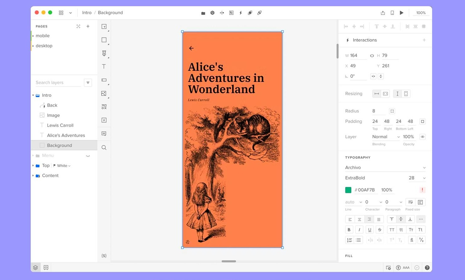
When your team needs more than static layouts and wants design work that closely mirrors real code, UXPin stands out. I have used it on projects where development speed and design consistency were critical, and it truly changes how designers and engineers work together.
Unlike most tools that focus only on visual layout, UXPin connects design systems to actual component libraries. This makes the transition from visual concept to working product smoother and faster.
What UXPin Does Well
Design With Real Code Components: UXPin’s signature feature is Merge, which lets you sync real code components into your design files. These are not just visual replicas — they are the actual components used in your development environment. If your engineering team builds UI elements with React, Bootstrap, or other frameworks, those same elements can be dragged into the UXPin canvas.
The advantage is that what you design is what your developers will build. It reduces guesswork, prevents mismatches between design and code, and cuts down on back-and-forth communication.
Documentation and Specs Built In: UXPin lets you attach notes, specs, and documentation directly to your design. Reviewers and developers can see details about spacing, behavior, and interaction logic inside the tool itself. This keeps everything in one place instead of scattered across separate documents.
Interactive Prototypes: While wireframes focus on structure, UXPin allows you to build prototypes with real interactions. You can define interactions like hover, click, and transitions without exporting to another platform. It is not as animation-rich as some high-end prototyping tools, but it covers most practical interaction needs.
Where UXPin Feels Challenging
Steeper Learning Curve: Because UXPin has deeper functionality tied to real code and design systems, its interface can feel less intuitive than simpler tools. Designers accustomed to more visual tools like Figma might need some time to adjust.
Smaller Built-In UI Kit: Out of the box, the library of UI components is more limited compared with other tools. The real power comes when you connect your own code library — but building that initial connection takes effort.
Device Support and Access
UXPin is web-based, so you can work from Macs, PCs, or in browser. There are no separate desktop apps. That makes access easier, but you do need a reliable internet connection for the best experience.
Pricing Snapshot
- Free plan: Limited to basic prototypes
- Paid plans start around $6 per editor per month: Includes more complex prototypes, interactions, and approvals
This pricing makes it one of the more accessible tools for teams that want code-linked workflows without a high subscription cost.
5. Justinmind
Best for Realistic Interactive Prototyping
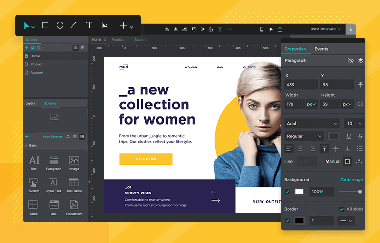
If your project requires more than static screens and you need to test how the product feels while users interact with it, Justinmind deserves serious consideration. I have used this tool on several UX research iterations where click-through behavior, form interactions, and real input fields mattered for early testing.
Unlike simpler wireframe tools that only link screens with basic transitions, Justinmind lets you build genuine interactive experiences that feel like early versions of the real product.
What Justinmind Does Well
Advanced Interaction Support
Justinmind goes beyond simple “click to next screen” interactions. You can add:
- Working input fields that accept real text
- Dropdowns, radio buttons, sliders, and checkboxes with behavior
- Conditional logic (for example: show error if form is empty)
This means usability testing sessions actually feel real, because users are interacting with a prototype that behaves more like a finished app rather than just a visual mockup.
Built-In UI Kit: The tool comes with a comprehensive library of UI components you can drag and drop. It helps speed up the layout process without needing third-party plugins or external libraries.
Multiple Screen Management: For projects with several screens, Justinmind’s canvas makes organization easier. You can see the flow between screens, plan navigation paths, and adjust transitions without bouncing between files.
Usability Testing Ready: Because of its real interaction capabilities, Justinmind prototypes are often used in usability tests. Teams watch users interact with forms, menus, and flows in something that feels close to actual software.
Limitations You Should Know
Desktop Only: Justinmind is not browser-based. You need to download and install it on your Windows or Mac machine. That can be a downside if you want to share early drafts quickly with reviewers on different devices.
Can Get Slower With Large Projects: When your prototype file grows with many screens and interactions, it can feel slightly laggy. It is not a deal breaker, but worth noting if you plan very detailed prototypes with many conditional states.
Collaboration Is Not Real Time: Unlike tools such as Figma, multiple people cannot edit the same screen at the same time. Justinmind’s collaboration model is based on file sharing and version control rather than live co-editing.
Pricing Snapshot
- Free plan: Available, with limited features
- Paid plans start around $9 per editor per month: Includes advanced interaction options and mobile testing features
For teams that run frequent user testing or need realistic form and navigation behavior, the paid plan is worth the investment.
Justinmind is best when yourfocus is on interaction, not just layout and your need to validate user flows before development. Think of Justinmind as a step between wireframe and polished prototype. It is stronger than simple click-through mockups and more realistic for testing than many basic prototyping tools. If your priority is testing how a user moves through tasks rather than just showing screens, Justinmind adds significant value.
Which One Should You Choose?
Choosing the right wireframe tool can have a big impact on how smoothly your project moves from idea to design to development. Each tool we covered has strengths and limitations, and the best choice depends on what you really need from your workflow.
Here is a practical breakdown to help you decide:
If You Need a Complete Design Platform: Choose Figma
Figma is the most versatile option on this list. It supports everything from simple wireframes to polished UI and interactive prototypes. Its real-time collaboration features and shared libraries make it ideal for teams that work together closely and want one tool for the entire design process.
If You Want Simple and Fast Wireframes: Choose Moqups
Moqups is beginner-friendly and easy to pick up. It lets you create basic layouts quickly without a steep learning curve. If your goal is early-stage idea sketching and team alignment without detailed design features, this is a solid choice.
If Your Focus Is Communicating Structure Clearly, Choose Balsamiq
Balsamiq’s sketch-style wireframes keep attention on layout and flow, not styling. This makes it ideal when you need to present ideas to stakeholders, non-designers, or clients who care about content and placement more than visuals.
If You Want Design Closely Aligned With Code: Choose UXPin
UXPin uniquely lets you build with real components from production code. This reduces guesswork between design and engineering. If your workflow involves shared design systems or component libraries, UXPin can speed up development and reduce friction.
If You Need Realistic Interaction for Testing: Choose Justinmind
Justinmind goes beyond static wireframes and simple prototypes. Its interactive elements and conditional behavior make it useful for usability testing and early user validation. If understanding how users interact is your priority, this tool delivers deeper insights.
Wrap Up
Wireframing is a foundation of good design. It helps you think clearly about structure, flow, and user needs before you spend time on visual polish or development. Wireframes should be quick to make and easy to revise. And it is also important that your choice of tool matches your team’s size, process, and goals. There is no one “perfect” wireframe app; there is only the right one for your workflow.
If you want an all-around design platform that grows with your project, Figma is unmatched. If your priority is simple idea sketches, Moqups and Balsamiq are great options. If your focus is advanced interactions or linking design to code, Justinmind and UXPin deserve attention. And if you want AI-driven idea generation, Visily is worth exploring.
Frequently Asked Questions (FAQs)
What is the difference between a wireframe and a prototype?
A wireframe focuses on structure and layout. It shows where elements like buttons, images, and text blocks will be placed, but without final design details.
A prototype goes a step further. It adds interaction. Users can click, navigate, fill forms, and experience flows almost like a real app. Wireframes are about structure. Prototypes are about behavior.
Is Figma good for wireframing?
Yes, Figma works very well for wireframing. You can create simple low fidelity layouts using basic shapes and text. It also allows you to turn those wireframes into detailed UI designs and interactive prototypes later.
For teams that want one tool from idea to final design, Figma is a strong choice.
Are free wireframe tools enough for startups?
In many cases, yes. Free plans from tools like Figma, Moqups, and Visily are good enough for early stage startups validating ideas.
However, once your team grows or your product becomes more complex, paid plans offer better collaboration, version control, and advanced prototyping features.
Can I create wireframes without design experience?
Yes. Tools like Balsamiq and Moqups are designed for non designers. They use simple drag and drop elements and ready made UI components.
Wireframing is more about logical thinking and user flow than visual creativity. Even product managers and founders can create effective wireframes.
What is the best wireframe tool for UX designers?
It depends on the workflow.
- If collaboration and scalability matter most, Figma is widely used by UX designers.
- If interaction testing is important, Justinmind offers stronger interactive capabilities.
- If working closely with development teams using shared components, UXPin may be more suitable.
Do developers need access to wireframe tools?
Not always, but it helps.
When developers can review wireframes directly inside tools like Figma or UXPin, misunderstandings reduce. It improves alignment between design and development and speeds up handoff.
How detailed should a wireframe be?
A wireframe should be detailed enough to explain layout and user flow clearly, but not so detailed that it becomes a visual design.
It should answer structural questions like:
- Where does the user start
- What actions are available
- How does the user move to the next step
Visual styling can come later.
Is AI useful for wireframing?
AI tools like Visily can help generate initial layouts quickly from text prompts or screenshots. They are useful for brainstorming and early ideation.
However, AI generated wireframes usually need manual refinement before moving into full product design.
Should I use one tool for everything?
Some teams prefer one all in one tool such as Figma. Others use multiple tools for different stages, for example Balsamiq for early structure and Figma for final UI design.
The right approach depends on team size, budget, and how complex your product is.