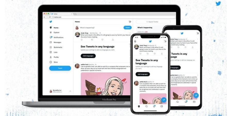

Twitter is introducing revamped website and apps with an aim to cut down the clutter. The company also wants apps and website to be easier to use. Twitter is also implementing its new font “Chirp” and also changing several elements of the design.
Chirp is Twitter’s first proprietary typeface and was introduced in January. This font will give Twitter its own visual expression and will also be used in brand advertising.
The company is also making all Western-language text-align left. Colors on the website have also been updated for improved readability. Now there’s less of Twitter’s blue on the site. The company has also shifted navigation to black on a white background on the default theme. Buttons are also now in high contrast. Twitter has also removed some of the visual clutter like unnecessary divider lines.
Not all Twitter users are happy with the changes. Some users even called the new font “ugly” or “unfinished.”
Twitter is now rolling these changes to the web, Android, and iOS. Let us know if you have started seeing changes and how do you like them.