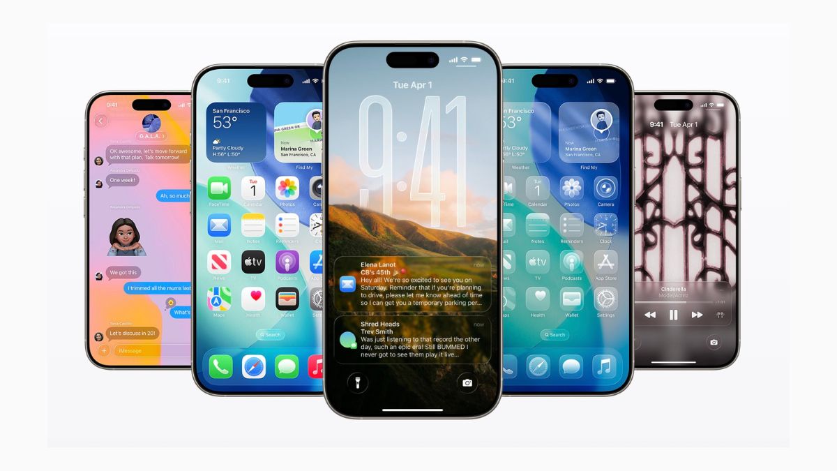
Apple has introduced a new Liquid Glass design in iOS 26. It gives the system a transparent, layered look. Some users like the new design. It looks modern and fresh. But not everyone is happy with it. One common complaint is about readability. Because of the transparency, text and icons in areas like the Control Centre or widgets can be hard to read, especially if you are using a bright or detailed wallpaper.
Apple’s Liquid Glass design makes backgrounds partially visible behind menus. This is meant to create a glass-like visual effect. But when the wallpaper has too many colors or patterns, it affects contrast. This makes the text look faint or hard to see.
The good news? You can fix this in seconds.
Also read: Download the new iOS 26 wallpapers now
How to reduce transparency in iOS 26
Apple already has a setting that can help. It is called Reduce Transparency, and it is available under Accessibility settings. Here is how to enable it.
Open the Settings app and tap on Accessibility. Now, Go to Display & Text Size. In the final page, turn on Reduce Transparency.

That’s it.
Once you enable this, iOS will reduce the transparency in system backgrounds. This includes the Control Centre, menus, widgets, and notifications. The result is a cleaner, more readable interface, without fully removing the new design look.
If you are someone who likes the look of iOS 26 but finds it hard to read text in some areas, this small change can make a big difference. It improves usability without affecting how the system feels.
Try it and see if it helps. You can always turn it off if you do not like the result. Have you faced this issue on your iPhone? Let me know in the comments.
Also read: List of iPhones Compatible with iOS 26