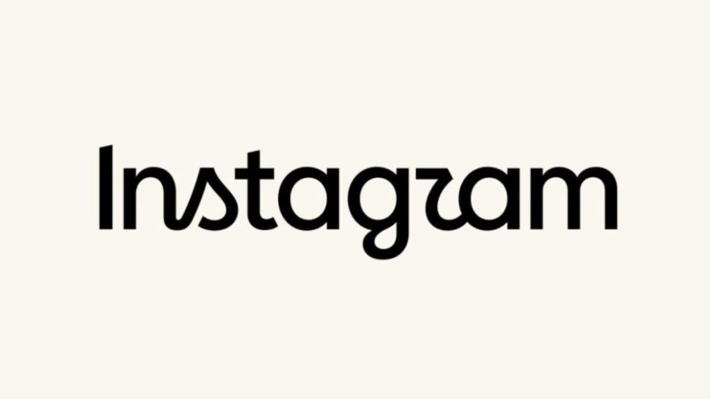
Instagram has redesigned its wordmark for the first time in about a decade. The familiar cursive lettering has been replaced with a new design that mixes cursive elements with a more traditional print style.
Instagram says the change is meant to make the wordmark feel cleaner and more modern while still keeping references to its original identity. Instagram head Adam Mosseri announced the change, saying the wordmark at the top of the app had not changed in 10 years.
The new design is a noticeable departure from the wordmark Instagram has used since 2016. That version became closely associated with the platform’s visual identity, alongside its colorful camera icon.
Instagram has not changed the entire brand identity. The update mainly focuses on the wordmark, which appears across the app and other Instagram branding.
The redesign has received a mixed response online, with many users comparing the new wordmark with the previous version.
The old cursive design had become highly recognizable after years of use. Replacing it was therefore always likely to attract attention, particularly because the change is subtle rather than a complete rebranding.
Whether the new wordmark actually feels more modern is subjective. But Instagram has clearly decided that its decade-old typography needed an update.
Related Posts