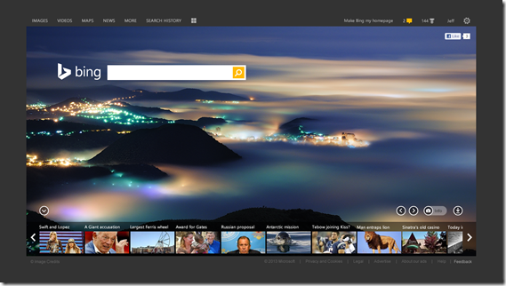
Microsoft has rolled out a big makeover for its search engine Bing. Company has given it a new refreshed design and a branded new logo. With this new design, Microsoft aims to give cleaner, faster and visually appealing search experience.
![]()
“Within our product team, we talk about the goal of Bing as always being helpful, human and beautiful. To chart this course, we have also rebuilt Bing.com with a beautiful new, modern design focused on simplicity, speed and visual appeal to give people a better search experience regardless of the device they are using,” Microsoft said about the changes.
Microsoft persons have done lots of work in makeover. They have evaluated colors, font and design. And the final result is really good. Microsoft has also created a place where you can learn more about the new design.
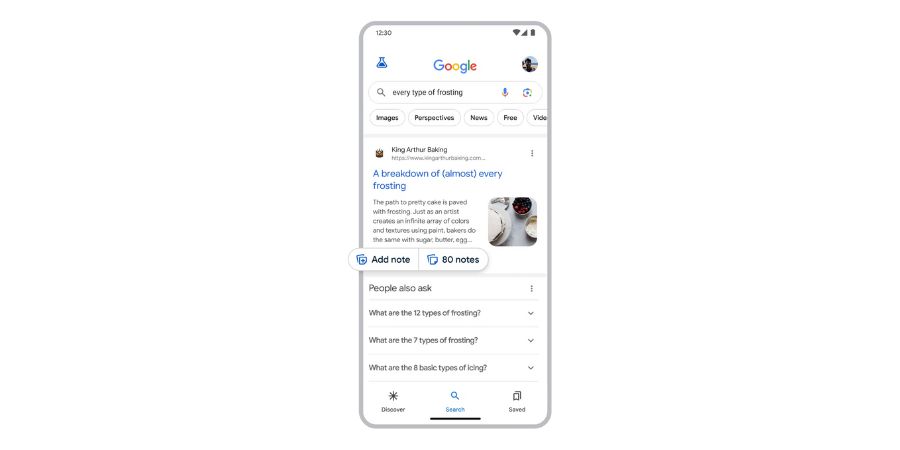
One of the big new changes is “Page Zero” that provides the quick answers to users’ query. Page Zero pops up as user type a search query in the search box.
Bing also gets a new area at the top of search results that also answers directly. This area is called Pole Position. This area only appears when Bing is confident that it knows the correct answers. Bing’s new features make it easy for Microsoft to integrate the power of search with its products such as Xbox and Windows Phones.
“Our new design displays both the factual data about this beautiful route (length, date, related places), and also the human perspective whether they be status updates, photos, tweets, check-in’s or expert opinions,” the company added.
See the video below to know more: